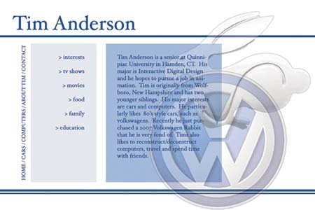
-I like the font choice for my name. But I think I would prefer a sans serif font for the body. It works ont he menu nav in the middle...but not sure it does on the side links that are vertical.
-I like the color choices and the layout. Perhaps too much negative space in the middle light blue nav box?? If so, not by much. The stripes work well and resemble automotive pinstripes on a car. The main body text box might need to be screen back more or something so the text is a little clearer.
-Overall I like the look and personality of the website. Perhaps we could add a splash of color?
1 comment:
Good job Lindsay!
-I like the font choice for my name. But I think I would prefer a sans serif font for the body. It works ont he menu nav in the middle...but not sure it does on the side links that are vertical.
-I like the color choices and the layout. Perhaps too much negative space in the middle light blue nav box?? If so, not by much. The stripes work well and resemble automotive pinstripes on a car. The main body text box might need to be screen back more or something so the text is a little clearer.
-Overall I like the look and personality of the website. Perhaps we could add a splash of color?
Post a Comment